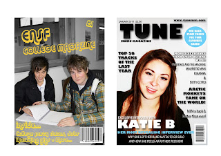
Looking back at my preliminary task now I have finished my final product I can see how much I have learnt from doing both tasks and how learning more about the tools and effects on Photoshop has helped massively as you can see the difference in the two products and the magazine definitely looks a lot better constructed.
There were four main techniques I used, these were Space reduction, Rulers, Quick Selection Tool and Drop Shadow. The first one that I learnt that was probably the most useful was the Rulers tool, especially for my feature article page I used this a lot. It learnt how to move the rulers so that they would come onto my page and I could line up each column of my article so it looked like a real magazine with equal gutter sizes in between.
Another technique I found very useful was the quick selection tool. I learnt that by going round certain parts of an image using this tool you can change the colour of it and keep the rest the same without having to crop it all and doing it on separate pages and pulling the image apart, so this was one of the best tools to use.
The next tool I learnt how to use was the space reduction tool, I learnt how to use this for my front page mainly because I wanted to group some of the text closer so it would stay in the necessary place without the reader getting it confused with any other part of the magazine because the writing wasn’t clear enough.
Finally the last main technique I learnt how to use that was very useful was the drop shadow, because all three of the backgrounds on my magazine pages were white the writing just looked as if it was floating and it didn’t look like it was a real magazine so I changed the drop shadow on the writing and headings so there was a darker tone around the writing to make it stand out a bit more and so it was something a little bit different and didn’t make the magazine look cheap and boring.
No comments:
Post a Comment