Tuesday 22 March 2011


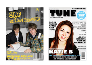
These are some of the images that i had taken and was going to use on my music magazine. I did a couple of shoots to make sure i was getting the right photograph to go onto my front cover to represent the magazine in the way it needs to, for my target audience to be attracted to.

Original Images


These are some of the original photographs i had taken for the preliminary task, the college magazine. I decided to take as many different types of images as i could so i had a range to pick from for my final ones. Here are a few of the ones that i thought were the best, and i made my final selection from these. For my final images i have used bits of a couple of these but edited them on Photoshop to create the best image for my college magazine front cover.

Tuesday 15 February 2011

Looking back at your preliminary task (the college magazine task), what do you feel you have learnt in the progression from it to full product?


Looking back at my preliminary task now I have finished my final product I can see how much I have learnt from doing both tasks and how learning more about the tools and effects on Photoshop has helped massively as you can see the difference in the two products and the magazine definitely looks a lot better constructed.
There were four main techniques I used, these were Space reduction, Rulers, Quick Selection Tool and Drop Shadow. The first one that I learnt that was probably the most useful was the Rulers tool, especially for my feature article page I used this a lot. It learnt how to move the rulers so that they would come onto my page and I could line up each column of my article so it looked like a real magazine with equal gutter sizes in between.
Another technique I found very useful was the quick selection tool. I learnt that by going round certain parts of an image using this tool you can change the colour of it and keep the rest the same without having to crop it all and doing it on separate pages and pulling the image apart, so this was one of the best tools to use.
The next tool I learnt how to use was the space reduction tool, I learnt how to use this for my front page mainly because I wanted to group some of the text closer so it would stay in the necessary place without the reader getting it confused with any other part of the magazine because the writing wasn’t clear enough.
Finally the last main technique I learnt how to use that was very useful was the drop shadow, because all three of the backgrounds on my magazine pages were white the writing just looked as if it was floating and it didn’t look like it was a real magazine so I changed the drop shadow on the writing and headings so there was a darker tone around the writing to make it stand out a bit more and so it was something a little bit different and didn’t make the magazine look cheap and boring.


I have learnt many new skills whilst making my music magazine as I have been using programmes that I didn’t know a lot about before starting this. Photoshop was the main programme I used throughout the process of creating the front cover, contents page and feature article. Some of the tools and effects I used are quick selection tool, spot healing brush, gradient map, brightness/contrast and rulers. These were the main ones I used a lot and from constructing this product I have learnt how to use them properly and more effectively.
I didn’t use ‘Flickr’ for my annotation of products but I did go on there so see how it works and I did learn quite a bit from it but just decided against using it as I preferred doing it in my own way.
Another thing I learnt a lot about was how to use the internet website ‘Blogger’, from uploading my finished products on there and annotating existing products I learnt different ways to do so and which are easier and better for the layout of the finished design.

How did you attract/address your audience?

The promises on my cover say that they could winback stage passes for their favourite bands in concert so they would want to go to this and therefore buy the magazine to be in with a chance. The bands mentioned on the front cover are all the bands my target audience would be into, so by having bits of information on the front cover about them and what is going to be in the magazine the audience is attracted and will therefore then buy the magazine. I tried to put as much language that the target audience would use onto my magazine so they feel they can read it easier as it’s just how they talk and understand things. I also used jargon words like ‘indie rockers’ as a band name on the front cover because the magazine is aimed at an indie/rock music genre so this fits in well with that and attracts the readers as they know what they will be getting in the magazine. Another way I felt I attracted the audience was by using a model in the age range of my target audience, because if they see someone a similar age they are more likely to buy it to see what other people their age have achieved and what they can achieve themselves.

Who would be the audience for your media product?

The audience of my magazine is 16-30 year olds, mainly a male audience but also attracting female readers too. They are all into fashion and that is something very important to them, these people would perhaps shop in places like, Topshop/Topman, Cult, Levis, Fred Perry, Converse and even some of them would go into charity shops for the more vintage items of clothing. Indie Rock is their Genre of music, listening to bands like Kings of Leon, Arctic Monkeys and Kasabian. They would be attracted to my magazine mainly because of the music features, but also because of the gigs and fashion parts of the magazine too. My intended audience would be into going to music festivals in the summer like Glastonbury, Reading, V Festival and Lattitude.

What kind of media institution might distribute your media product and why?


The media institution I think that would distribute my magazine would be IPC who brought NME magazine. IPC Media produces over 60 iconic media brands, with print alone reaching almost two thirds of UK women and 42% of UK men – almost 26 million UK adults – while our websites collectively reach over 14 million users every month. IPC Marketforce is the UK's leading news trade sales and Distribution Company, successfully marketing 23% of the total magazine category. I think IPC would be a good company because my music magazine is very similar to NME and the way that is sold would benefit my magazine in the same way it does for NME. I think going mainstream and selling the magazine in all types of shops would benefit TUNE magazine and help it reach a higher goal. I also think my magazine might have its own music channel on the TV where the readers of TUNE can go and listen to the type of music they are reading about in the magazine.